A visual study of popular logo
• Brand name : Calvin Klein
• Industry : Calvin Klein is primarily associated with the fashion industry, particularly known for its clothing, accessories, and fragrance lines.
• Designer : The iconic Calvin Klein logo was designed by graphic designer Paul Rand. The logo features the "cK" initials in lowercase, often presented in a simple and elegant manner.
• Meaning behind the logo : The Calvin Klein logo, designed by Paul Rand, features the letters "cK" in lowercase. The logo is known for its simplicity and minimalism. The "cK" represents the initials of Calvin Klein, and the design embodies the brand's clean, modern, and timeless aesthetic. The lowercase letters and sleek design convey a sense of understated elegance and sophistication, reflecting the style associated with Calvin Klein products
• Why did you choose the brand ?
Calvin Klein's inclusive philosophy is further strengthened by its unisex clothing range and inclusive sizing options. CK products are designed with high-quality construction and a focus on eliminating unnecessary details, resulting in unique and modern comfort.
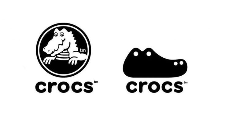
• Brand name : Crocs
• Industry : Crocs, Inc. is a company that operates in the footwear industry. They are best known for their distinctive foam clog-style shoes, often referred to as "Crocs."
• Designer : The Crocs logo was designed by Terrance Reeb, an artist and designer. The logo features a stylized representation of a crocodile, which reflects the company's name and brand identity.
• Meaning behind the logo : The Crocs logo features a stylized representation of a crocodile. The choice of a crocodile in the logo aligns with the brand's name, "Crocs." Crocodiles are often associated with durability, strength, and resilience in nature. By incorporating a crocodile into their logo,
• Why did you choose the brand ?
I personally like this brand as it provides a lot of comfort to the consumers due to its unique foam materials which provides a good support, and not only that but also Crocs has built a strong and dedicated fan base, fostering brand loyalty among consumers.
• Brand name : Nutella
• Industry : Nutella is a product of the food and beverage industry. It falls into the category of hazelnut cocoa spreads. The brand is owned by the Italian company Ferrero.
• Designer : The Nutella logo was designed by an Italian graphic designer named Pietro Ferrero. Pietro Ferrero was one of the founders of the Ferrero company, which created Nutella.
• Meaning behind the logo : The iconic Nutella logo features a distinctive red background with the brand name written in white letters. The design has become widely recognized and associated with the popular hazelnut cocoa spread.
• Why did you choose the brand ?
This brand is quiet famous since the last few years and most people are crazy about it. As it is a trendy and everyone's favourite.
• Brand name : Hyundai
• Industry : Hyundai operates in the automotive industry. It is a South Korean multinational automotive manufacturer that produces a wide range of vehicles, including cars, SUVs, and commercial vehicles
• Designer : The Hyundai logo was not created by a single designer, but it evolved over the years through the efforts of Hyundai's in-house design team.
• Meaning behind the logo : The logo features a stylized "H" symbolizing two individuals shaking hands – a representation of the company's commitment to customer satisfaction and trust.
• Why did you choose the brand ?
It is a well known and trustable brand. They offer more space, features, comfort compared to other cars. The cost of maintenance is slightly higher compared to the market leader Suzuki, but it is a fuss free ownership and Hyundai definitely has some excellent cars in it's lineup.
• Brand name : Sony
• Industry : Sony is known for its presence in electronics, entertainment (including music and film production),( headphone, television, video game) gaming, and financial services.
• Designer : The Sony logo was created by Yasuo Kuroki, an art director at Sony. The logo, often referred to as the "Sony Corporation emblem," has been used by the company since 1955.
• Meaning behind the logo : The Sony logo features a distinctive design with the letters "S" and "O" intertwined. The "S" and "O" are derived from the Latin word "sonus," which means sound. The intertwining letters symbolize the fusion of technology and emotion, emphasizing Sony's commitment to producing innovative and high-quality audio-related products.
• Why did you choose the brand ?
Sony products are well-known for their unsurpassed quality and reliability. It is also a well known and a popular brand and has lot of attention of the customers.


Comments
Post a Comment